
Background
Living in Santa Barbara can be tricky from a surfer’s perspective. When I moved here from San Diego, I learned that it takes far more diligence and knowledge of reading meteorological data in order to score some fun waves here. If you really know what you’re doing, you can even get some great spots all to yourself some days.
Lately, I have been hearing from the older locals that we have had the worst three winters in a row that they can remember. As I learned more about climate change in my undergraduate career alongside my own surfing research, I began to wonder if there’s a connection between climate change and surfing opportunities. Is this all in our heads as frustrated SB surfers? Could the increasing variability of storms due to climate change affect the surf in Santa Barbara?
This short blog post will focus on wave prevalence and attributes over time due to patterns in storm activity. I would like to use R to find out whether there has been a trend or pattern in surf availability based on time series buoy data using classical decomposition. If possible, I would also like to link this to the ENSO cycles.
Motivation
Most, if not all adventure sports are being somewhat impacted by climate change due to their dependency on wind, rainfall, temperature, swell, snowmelt, and other climate variables. We have already seen effects of increased climate variability on the adventure tourism industry, specifically in snow sports (Buckley, 2017). But how does climate change relate to surfing? Rising sea level paired with anthropogenic variables such as coastal development and depleted sand banks (from upstream hydroelectric dams) combine to exacerbate coastal erosion. This can alter underwater bathymetry that creates the waves we salty people depend on (Arroyo, 2019). Many surfing locations all over California have been both tragically lost and accidentally created at the hand of human activity.
Within the realm of surf frequency and quality, a key predictor of any given year’s surfing potential in California is the El Niño Southern Oscillation (ENSO) status. During El Niño years, the storm track over the North Pacific is usually enhanced, and we see swells travel from straight West through the Santa Barbara Channel. During strong events, California sees especially significant surf. During La Niña, blocking high pressure over the pacific during winter typically limits tropical swells in the eastern pacific, and shifts the storm track to the North, causing many swells to miss the Santa Barbara Channel (Surfline, 2020).
This winter (2022-23), there is a 76 percent chance that we will be experiencing our third La Niña even in a row, which is relatively rare (Johnson, 2022). Climate change is causing some strange anomalies in the ENSO cycle. According to National Oceanic and Atmospheric Association (NOAA) researcher Michael McPhaden, “Extreme El Niño and La Niña events may increase in frequency from about one every 20 years to one every 10 years by the end of the 21st century under aggressive greenhouse gas emission scenarios.” (research.noaa.gov). The last extreme ENSO event that we have had was the winter of 2015-2016, when a brutal stream of storms battered the Santa Barbara coastline, causing considerable damage, and amazing surf.
About the data
Show Code
knitr::include_graphics("images/buoy_pic.png")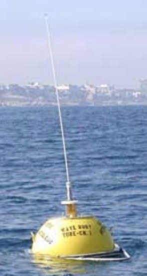
I used data from the buoy that I look at every day that guides all my surf decision making, the Harvest Buoy off Point Conception. It is owned by the Scripps Institute of Oceanography and its data is distributed by NOAA. This buoy has been up and running since 2004, but the data has a few large gaps (I think because of maintenance or malfunction reasons) up until 2010. From 2010 onward, there are two observations every single hour of every day until this moment. The measurements that I am interested in are wave height, dominant wave period - basically wavelength, average wave period, and swell direction.
There are seemingly many ways to retrieve this data, but the one that I was able to get to work was through this link:
https://www.ndbc.noaa.gov/station_history.php?station=46218
You can access a description of this data and variables through this link: https://www.ndbc.noaa.gov/measdes.shtml
The published data is in text files, with fields separated by spaces. I used the base R read.table() function to read the measurements into a data frame. With this function I still had to do some renaming and matching of the columns but it left the data intact.
I ended up with this dataframe below which has observations of wave height, dominant period, average period, peak swell direction, and temperature. The variables that I felt were relevant to this project were wave height (feet), swell direction (degrees), and dominant period (seconds).
Show Code
library(dplyr)
library(janitor)
library(here)
library(tidyverse)
library(feasts)
library(readr)
library(tufte)
library(gt)
library(lubridate)
library(xts)
library(tsibble)

df_2010 <- read.table("data/txt_files/46218h2010.txt")
df_2011 <- read.table("data/txt_files/46218h2011.txt")
df_2012 <- read.table("data/txt_files/46218h2012.txt")
df_2013 <- read.table("data/txt_files/46218h2013.txt")
df_2014 <- read.table("data/txt_files/46218h2014.txt")
df_2015 <- read.table("data/txt_files/46218h2015.txt")
df_2016 <- read.table("data/txt_files/46218h2016.txt")
df_2017 <- read.table("data/txt_files/46218h2017.txt")
df_2018 <- read.table("data/txt_files/46218h2018.txt")
df_2019 <- read.table("data/txt_files/46218h2019.txt")
df_2020 <- read.table("data/txt_files/46218h2020.txt")
df_2021 <- read.table("data/txt_files/46218h2021.txt")

all_wave_df <- rbind(df_2010, df_2011, df_2012, df_2013, df_2014,
                     df_2015, df_2016, df_2017, df_2018, df_2019,
                     df_2020, df_2021)

waves_renamed <- all_wave_df |>
  rename(year = V1,
         month = V2,
         day = V3,
         hour = V4,
         minute = V5,
         wave_height = V9,
         dom_period = V10,
         av_period = V11,
         peak_direction = V12,
         temp = V15)

waves_clean <- waves_renamed |>
  select(year, month, day, hour, minute, wave_height, dom_period,
         av_period, peak_direction, temp)
head(waves_clean)
year month day hour minute wave_height dom_period av_period peak_direction
1 2010 1 1 0 13 1.65 12.50 8.69 287
2 2010 1 1 0 43 1.58 12.50 8.67 280
3 2010 1 1 1 13 1.55 12.50 8.93 290
4 2010 1 1 1 43 1.62 11.76 9.04 283
5 2010 1 1 2 13 1.57 12.50 8.63 300
6 2010 1 1 2 43 1.49 13.33 8.36 273
temp
1 14.2
2 14.2
3 14.1
4 14.1
5 14.2
6 14.1To create a quick visualization of what these variables look like, I calculated the mean of each one per year and made these very simple plots:
Show Code
#--- compare yearly mean wave height
yearly_mean_wvht <- waves_clean |>
  group_by(year) |>
  summarize(wave_height = mean(wave_height))
#plot(yearly_mean_wvht)

#--- compare yearly mean dominant period
yearly_mean_dom_period <- waves_clean |>
  group_by(year) |>
  summarize(period = mean(dom_period))
#plot(yearly_mean_dom_period)

#--- compare yearly mean swell direction
yearly_mean_direction <- waves_clean |>
  group_by(year) |>
  summarize(direction = mean(peak_direction))
#plot(yearly_mean_direction)

#--- Plot the three variables in a 1x3 row
plot(yearly_mean_wvht,
main = "Average wave height by year") 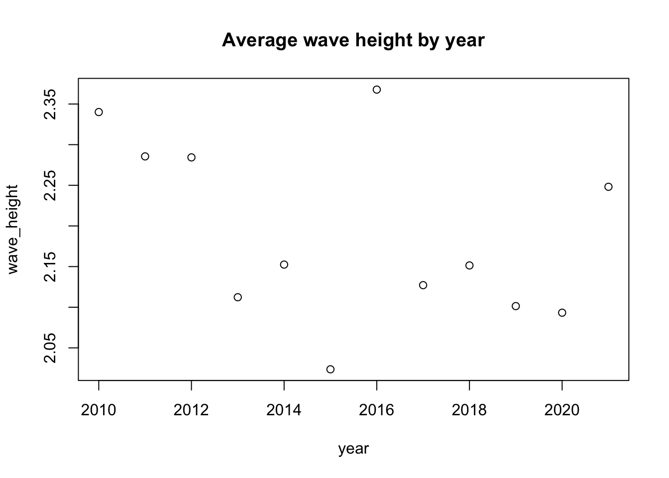
Show Code
plot(yearly_mean_dom_period,
main = "Average period by year") 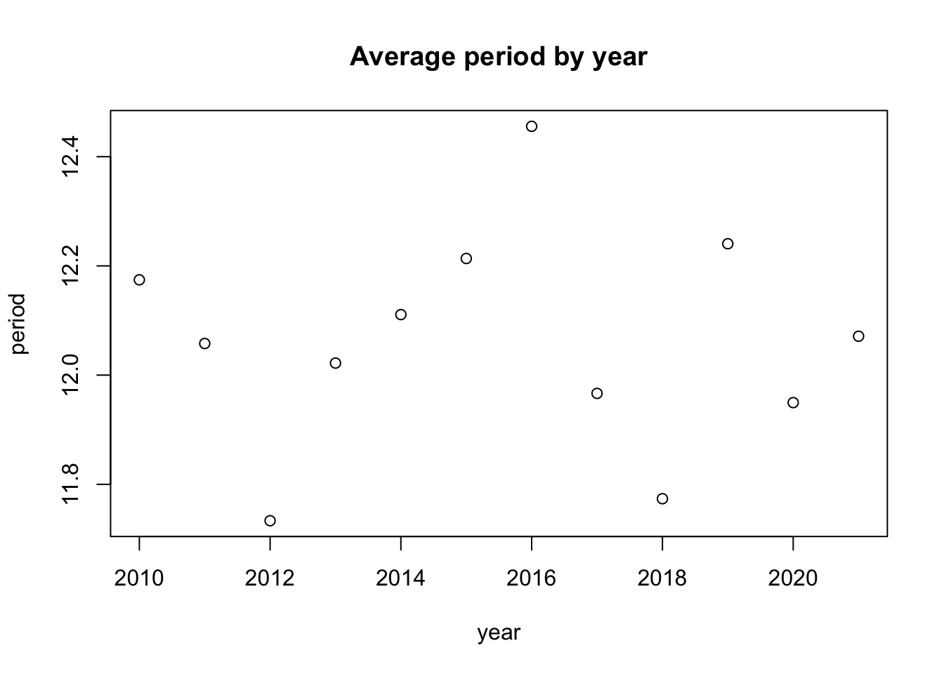
Show Code
plot(yearly_mean_direction,
main = "Average swell direction by year") 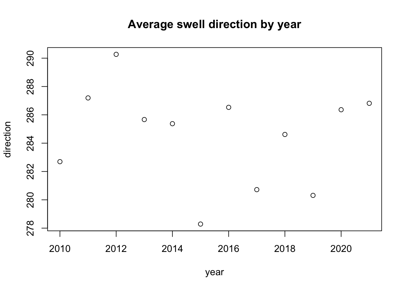
If you add a linear regression line to the wave height variable across years, you get this slightly concerning downward trend line. What could this mean? We know there are many factors playing a role in the distribution of wave height year to year, specifically seasonality and the El Niño Southern Oscillation cycles. To explore this relationship further, I would like to isolate seasonality and extract a long-run trend from this time series data using classical additive decomposition.
Show Code
#--- add an lm trend line to our wave height averages plot using ggplot
ggplot(data = yearly_mean_wvht, aes(x = year, y = wave_height)) +
  geom_point(col = "blue") +
  geom_smooth(method = lm, col = "red") +
  labs(title = "Average wave height by year with linear regression")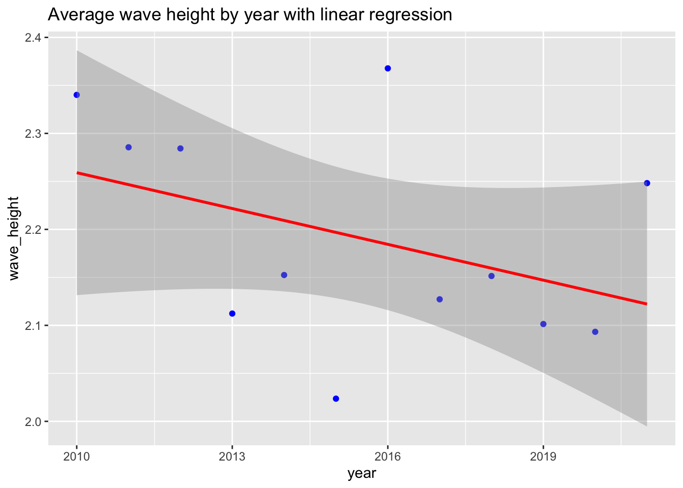
Decomposition
The North Pacific comes to life in wintertime, and goes back to sleep in the summer… for the most part. When dealing with very seasonal data like this it can be useful to create a classical additive decomposition model. This model will decompose the data into seasonal, random, and trend components like this: \[y_t = S_t + T_t + R_t\]
After we have separated these components we can plot them to compare which significantly impact our data. The classical decomposition model library function requires fixed and exact periodic intervals between data measurements. The original wave data was taken approximately every 30 minutes and was somewhat regular, but not exact. So, I converted the measurements to a daily median (more resistant to outliers). There were still some gaps in the data, so I used tsibble::fill_gaps() to populate the gaps with “na” and tidyr::fill() to convert the “na” values to the last good measurement. After feeding this through our decomposition model, you can see plots generated below for our variables of interest.
Show Code
#--- Add in ISOdate column to use in tsibble index
waves_clean$dt <- ISOdate(
    waves_clean$year,
    waves_clean$month,
    waves_clean$day,
    waves_clean$hour,
    waves_clean$minute,
    0
) |> na.omit()

#--- Convert to time series tibble
wave_ts = as_tsibble(waves_clean, index="dt")

#--- Create a regular fixed-interval time series by aggregating daily wave
# height as the mean height for each day.  Also, some days were missing,
# could be due to wrong days in a month, like Feb, so using fill_gaps() to
# add any needed rows and fill() to use prior measurement for the gaps.

wave_regular = wave_ts %>%
  index_by(index = ~ as_date(.)) %>%
  summarise(
    wave_height = median(wave_height),
    dom_period = median(dom_period),
    av_period = median(av_period),
    peak_direction = median(peak_direction),
    temp = median(temp)
  ) %>%
  fill_gaps() %>%
  tidyr::fill(wave_height, .direction = "down") %>%
  tidyr::fill(dom_period, .direction = "down") %>%
  tidyr::fill(av_period, .direction = "down") %>%
  tidyr::fill(peak_direction, .direction = "down") %>%
  tidyr::fill(temp, .direction = "down")

# Now, we have a "regular" fixed-interval tsibble with median measurements per day, with column 'index'

#--- Classical addititve decomposition of wave height
wave_regular %>%
  model(classical_decomposition(wave_height ~ season("1 year"),
                                type = "additive")) %>%
  components() %>%
  autoplot() +
  labs(title = "Classical addititve decomposition of wave height")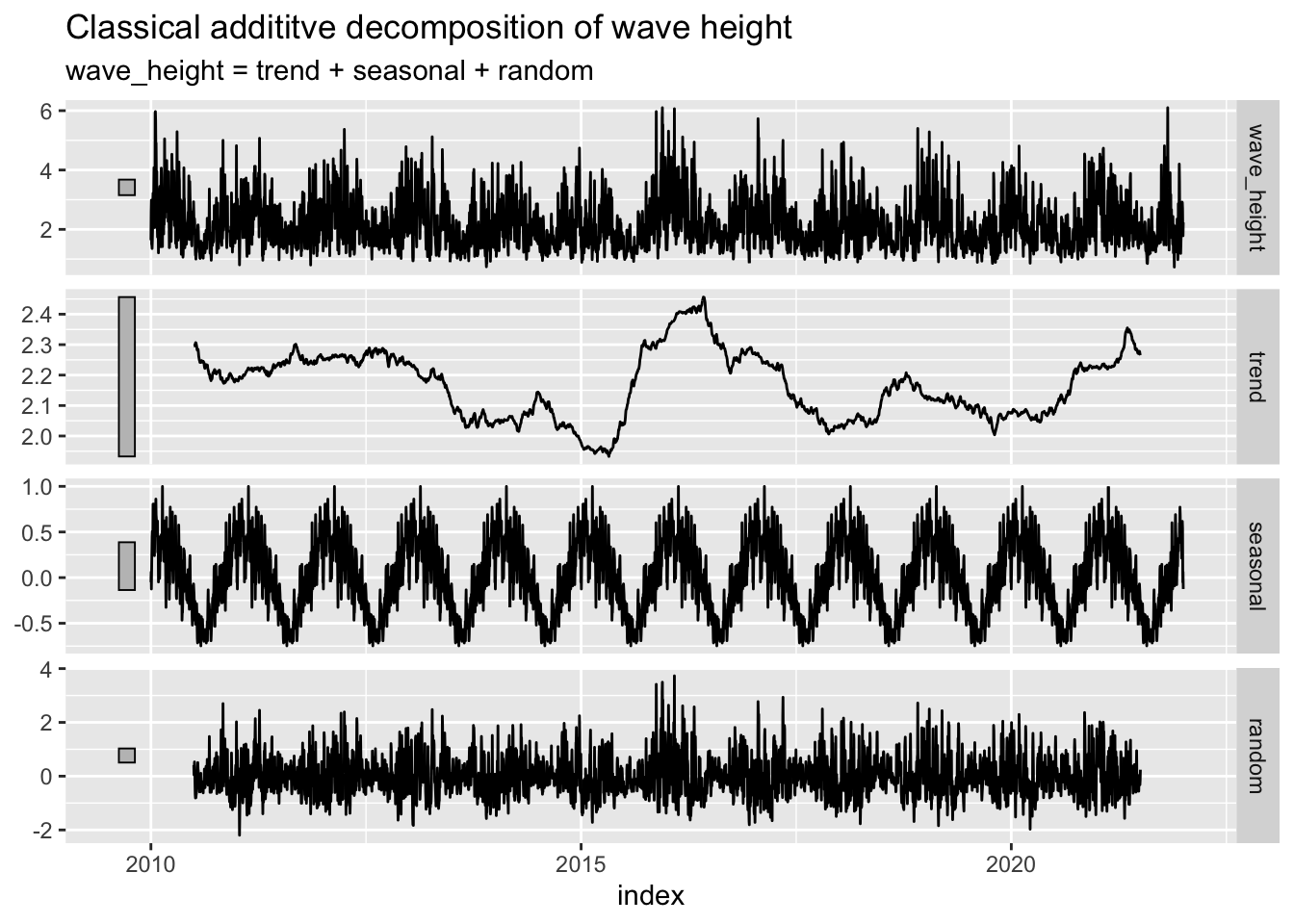
Show Code
#--- Classical addititve decomposition of dominant wave period
wave_regular %>%
  model(classical_decomposition(dom_period ~ season("1 year"),
                                type='additive')) %>%
  components() %>%
  autoplot() + labs(title = "Classical addititve decomposition of dominant period")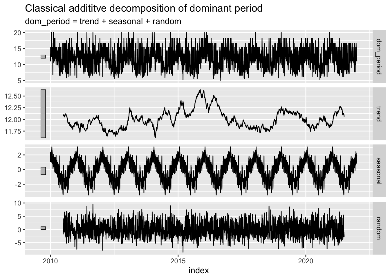
Show Code
#--- Classical addititve decomposition of average wave period
wave_regular %>%
  model(classical_decomposition(av_period ~ season("1 year"),
                                type='additive')) %>%
  components() %>%
  autoplot() + labs(title = "Classical addititve decomposition of average period")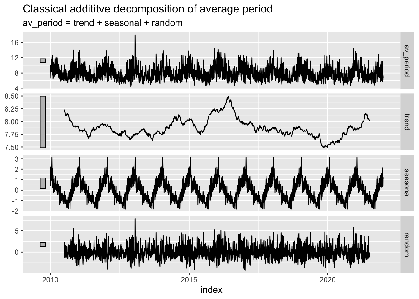
Show Code
#--- Classical addititve decomposition of peak swell direction
wave_regular %>%
  model(classical_decomposition(peak_direction ~ season("1 year"),
                                type='additive')) %>%
  components() %>%
  autoplot() + labs(title = "Classical addititve decomposition of peak swell direction")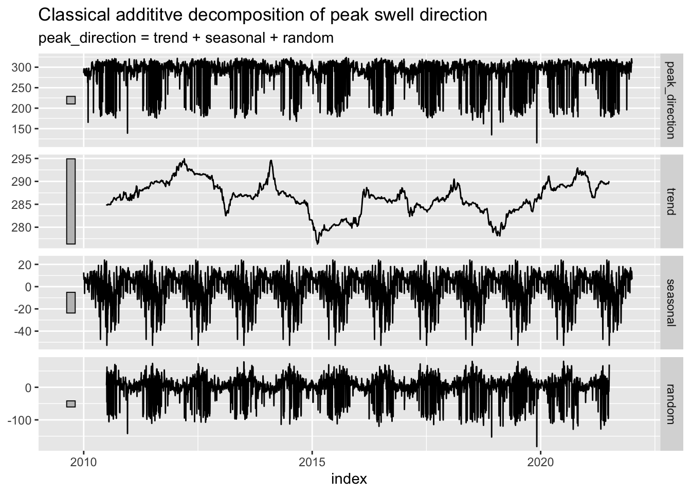
Decomposition Analysis
As you can tell looking at these decomposition plots, there’s no way to make out a definitive trend in any of the variables, whether they are going up or down over time. Additionally, this is a very short time period in the grand scheme of climate change over time since the industrial revolution. Perhaps we could visualize more meaningful relationships over time if these measurements had taken place since the 1940s or so.
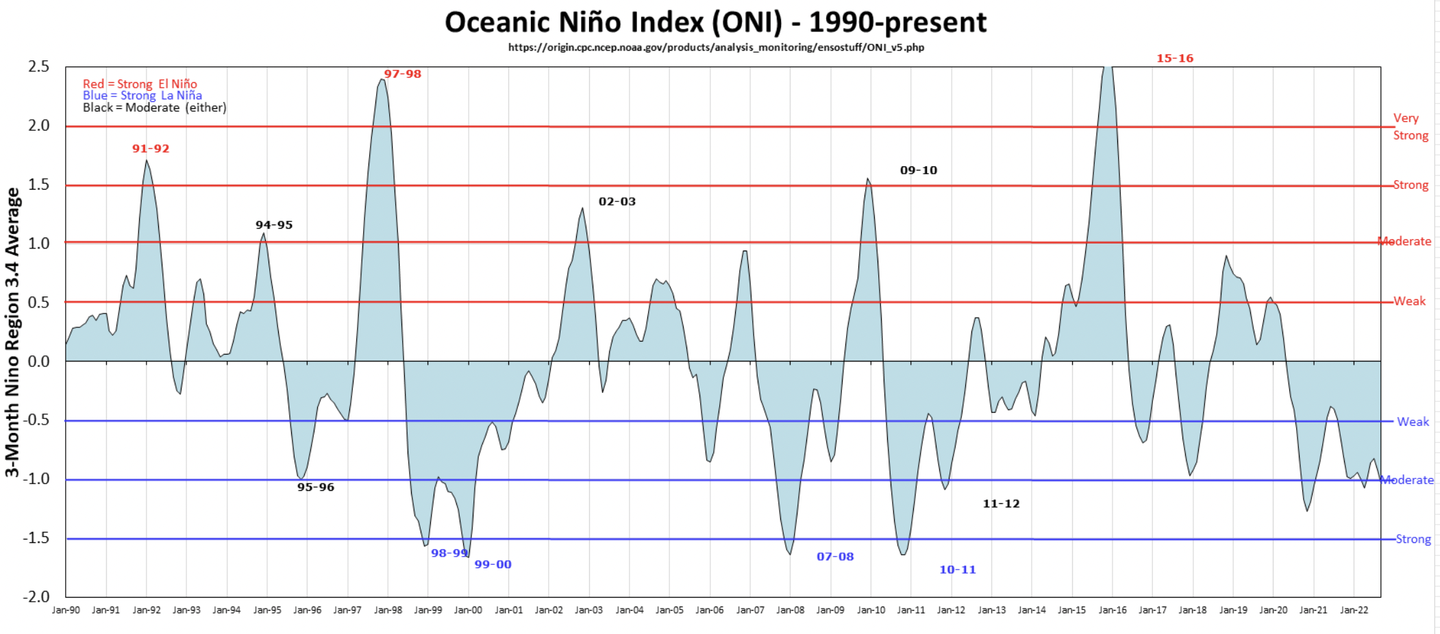
However, we do see an interesting spike in wave height and period during a time period around 2016. We also see a sharp drop in swell direction to about an average of 280 degrees. These conditions are all very favorable to surfing in Santa Barbara. This time period around 2016 also aligns with the very strong El Niño event that took place that year. Here is a useful graphic of El Niño oscillations over our time period of interest (Null, 2022).
Another Question
Since we see the variables changing during this El Niño event, I would like to compare our wave height, period, and direction during a strong El Niño event with that of a strong La Niña event. Since there is only one of each happening within the 2010-2021 period that we have buoy data for, I will compare the 2010-11 La Niña event (June 1, 2010 - May 31, 2011) with the 2015-16 El Niño event (April 1, 2015 - March 31, 2016).
First, I’ll subset our time series dataframe into just those time periods, with an added enso column that will either say “el_nino” or “la_nina”. Then I will be able to use the stats::t.test() function to determine whether the difference in means of our variables of interest differ statistically between strong El Niño and La Niña events.
Show Code
#--- create la nina filter: june 1, 2010- may 31 2011 and create an enso column that says that it was la nina

la_nina <- wave_regular |>
  filter(between(index, as.Date("2010-06-01"), as.Date("2011-05-31")))
la_nina$enso <- "la_nina"

#--- create el nino filter: june 1, 2010- may 31 2011 and create an enso column that says that it was el nino

el_nino <- wave_regular |>
  filter(between(index, as.Date("2015-04-01"), as.Date("2016-03-31")))
el_nino$enso <- "el_nino"

#--- visualize the means of our variables
comparison_chart <- data.frame(enso = c(" 2010-11 la nina", "2015-16 el nino"),
                               mean_height = c(mean(la_nina$wave_height),
                                               mean(el_nino$wave_height)),
                               mean_period = c(mean(la_nina$dom_period),
                                               mean(el_nino$dom_period)),
                               mean_direction = c(mean(la_nina$peak_direction),
                                                  mean(el_nino$peak_direction)))

comparison_chart
enso mean_height mean_period mean_direction
1 2010-11 la nina 2.203219 11.87426 287.4562
2 2015-16 el nino 2.309850 12.49772 281.9139Significance Tests
In order to test whether these two ENSO events are significantly different in wave height, period, and swell direction, I will run three separate t-tests between the two time periods.
Wave height-
Null Hypothesis: There is no difference in the mean wave height of the 2010-11 La Niña event and the 2015-16 El Niño event.
Alternative Hypothesis: There is a difference in the mean wave height of the 2010-11 La Niña event and the 2015-16 El Niño event.
Show Code
#--- join these dataframes together to run t-test

comparison_df <- bind_rows(la_nina, el_nino)

#--- run t-test to see if enso status really affects our variables

#--- WAVE HEIGHT
t.test(wave_height~enso, data = comparison_df)
    Welch Two Sample t-test

data:  wave_height by enso
t = 1.6275, df = 673.93, p-value = 0.1041
alternative hypothesis: true difference in means between group el_nino and group la_nina is not equal to 0
95 percent confidence interval:
 -0.02201407  0.23527517
sample estimates:
mean in group el_nino mean in group la_nina
             2.309850              2.203219
We fail to reject the null hypothesis at the alpha = 0.05 significance level.
Dominant Period-
Null Hypothesis: There is no difference in the mean dominant period of the 2010-11 La Niña event and the 2015-16 El Niño event.
Alternative Hypothesis: There is a difference in the mean dominant period of the 2010-11 La Niña event and the 2015-16 El Niño event.
Show Code
#--- PERIOD
t.test(dom_period~enso, data = comparison_df)
    Welch Two Sample t-test

data:  dom_period by enso
t = 3.0192, df = 720.98, p-value = 0.002624
alternative hypothesis: true difference in means between group el_nino and group la_nina is not equal to 0
95 percent confidence interval:
 0.2180466 1.0288700
sample estimates:
mean in group el_nino mean in group la_nina
             12.49772              11.87426
We reject the null hypothesis at the alpha = 0.05 significance level.
Peak Swell Direction-
Null Hypothesis: There is no difference in the mean peak swell direction of the 2010-11 La Niña event and the 2015-16 El Niño event.
Alternative Hypothesis: There is a difference in the mean peak swell direction of the 2010-11 La Niña event and the 2015-16 El Niño event.
Show Code
#--- DIRECTION
t.test(peak_direction~enso, data = comparison_df)
    Welch Two Sample t-test

data:  peak_direction by enso
t = -1.9964, df = 728.15, p-value = 0.04627
alternative hypothesis: true difference in means between group el_nino and group la_nina is not equal to 0
95 percent confidence interval:
 -10.99248229  -0.09197763
sample estimates:
mean in group el_nino mean in group la_nina
             281.9139              287.4562
We reject the null hypothesis at the alpha = 0.05 significance level.
Discussion
It is interesting to see that with a significance value of alpha = 0.05, the difference in wave height was not statistically significant (but still close). However, the mean period was significantly smaller for the La Niña period than the El Niño, AND the mean swell direction was significantly steeper (more northerly, and less favorable for surfing in Santa Barbara) during the La Niña event. This lends support to the observation that El Niño years have bigger waves, longer periods, and a better swell direction (closer to 270 degrees) than La Niña years.
However, this is still relatively inconclusive, because no two ENSO cycles are exactly alike and we only have one of each here to compare. It is likely that different ENSO events have slightly different qualities and it would be irresponsible to generalize that just from comparing two of them we have uncovered some absolute truths. Nonetheless, comparing these two events did line up with what I outlined in the “motivation” section above. Due to the altering of the pacific storm track during an El Niño event, we see more waves coming straight into the SB channel (~270 degrees, straight West) without having to wrap around Point Conception to the North.
In further research, I would look into data from the West Santa Barbara buoy. This location is far more protected from north and south swells, which could be useful for more specific stats questions pertaining to just west swells. However, the refraction of swell around the islands and Point Conception sucks a lot of energy out of the swell which could decrease the variability in our data, therefore making statistical inferences more subtle.
In conclusion, that results I got here were probably known by many experts and most surfers via their own anecdotal evidence. Either way, it was still really cool to find evidence through my favorite buoy that supported my own real-life observations.
References
Arroyo, M., Levine, A., & Espejel, I. (2019). A transdisciplinary framework proposal for surf break conservation and management: Bahía de Todos Santos World Surfing Reserve. Ocean & Coastal Management, 168, 197–211. https://doi.org/10.1016/j.ocecoaman.2018.10.022
Buckley, R. (2017). Perceived Resource Quality as a Framework to Analyze Impacts of Climate Change on Adventure Tourism: Snow, Surf, Wind, and Whitewater. Tourism Review International, 21(3), 241–254. https://doi.org/10.3727/154427217X15022104437729
El Nino, La Nina, ENSO and What They Mean to Your Surf. (2020, April 17). Surfline. https://www.surfline.com/surf-news/el-nino-la-nina-enso-what-they-mean-to-your-surf/82991
Goldman, S. (2017, March 1). Storms, Powerful Waves Have Eaten Away Santa Barbara County Coastlines to Historic Levels. https://www.noozhawk.com/article/storms_waves_coastal_erosion_santa_barbara_county_historic_levels
How will climate change change El Niño and La Niña? - Welcome to NOAA Research. (2020, November 9). How Will Climate Change Change El Niño and La Niña? https://research.noaa.gov/article/ArtMID/587/ArticleID/2685/New-research-volume-explores-future-of-ENSO-under-influence-of-climate-change
Johnson, N. (2022, November 22). Another winter in La Niña’s grip? – November update to NOAA’s 2022-23 Winter Outlook | NOAA Climate.gov. http://www.climate.gov/news-features/blogs/another-winter-la-ni%C3%B1a%E2%80%99s-grip-%E2%80%93-november-update-noaas-2022-23-winter-outlook
Null, J. (2022, October 1). El Niño and La Niña Years and Intensities. https://ggweather.com/enso/oni.htm